Color : Computer Screen vs. Printed Ink
Making Things Beautiful
As screen printers, we love color. Much of our printing process revolves around color mixing and matching, and we’ve spent more time than we’d care to admit creating our process to get the most consistent colors possible. The biggest difficulty with color is the relationship between colors on a computer screen vs. printed ink. We have spent years calibrating our computers and programs to give us the most accurate view of colors possible and there are still discrepancies between what you see on screen, vs. a finished print.
Screen vs. Ink
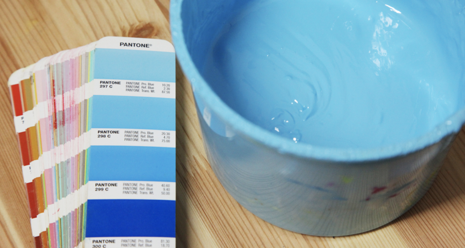
Our whole system is built on the Pantone Solid Coated color matching system, a universal color system that ensures color matching from customer to printer. We compare every ink color we choose with our physical Pantone guides. These guides give us a real life look at the color and keep us from ever being surprised by how a color turns out. Pantone 298C will look exactly the same in the book as it does on a shirt, if no other factors like shirt color are involved. So if you want full control of your prints with no surprises, we suggest you purchase a Pantone guide and call out your specific colors.
Computer Bright
Computer bright colors are colors on a computer screen that are outside the range of pigmented inks. Because a computer uses light to create color, it can hit much brighter and more intense colors than are possible with inks.
A good test in Photoshop is to take the eyedropper tool and select the brightest colors in your art. Then open the foreground color palette and click on color libraries. Select “PANTONE Solid Coated” from the drop down menu and Photoshop will automatically change your color to the closest Pantone equivalent. This will show you what to expect from your colors when they translate to a print. Pantone does offer a few neon colors, but the selection is very limited so you will have to decide if you value super bright colors more than an closest match to your art.
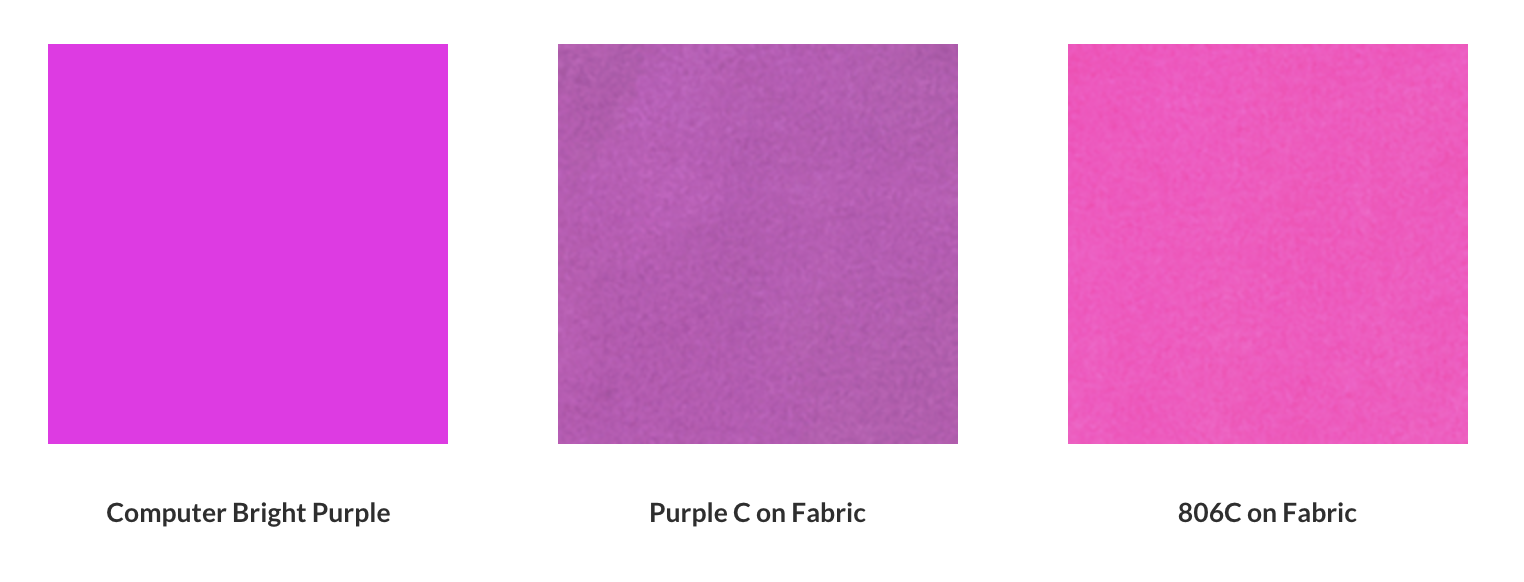
The chart below shows a computer bright purple. Next to it is the closest Pantone match, Purple C, printed on a white shirt. Notice how much saturation and brightness are lost. The image on the right shows the closest neon Pantone available, 806C. You can see how much brighter and more saturated it is than the Purple C, but the hue is significantly different. In this situation you would need to decide if the brightness of the 806C is worth sacrificing your exact color.