


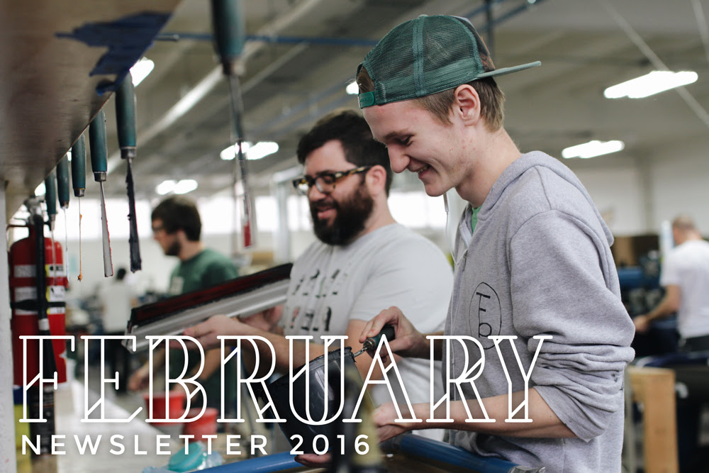
Trust Newsletter: February 2016
Newsletter Anniversary!

Wow, it’s hard to believe but it has been one year since we started these newsletters. It’s incredible that so many people are interested in the goings on of a little screen printing shop in Texas. We are so grateful for everyone who continues to read these, and for the kind words we have gotten about it. If you’re interested in reminiscing on the year’s worth of newsletters, or if you joined us late and would like to go back and see where we were at last February, we have a full archive of our newsletters on our blog.
Ink Innovation
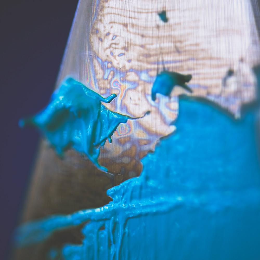
We talk a lot about innovation, and it’s something we always try to keep on our minds. Our latest project is a vital one, innovating our inks. The ink is our physical contribution to the finished product, and we are in the process of finding the absolute best ink systems for Trust.
The spark of all this was an amazing shirt Matt bought when he was in Spain last year. It had bright beautiful colors and it was thin, soft, and stretchy. It was our dream print, and we immediately decided that this Spain shirt was our new goal. The path we had to take to reach this goal is a brand new one for Trust, HSA ink. HSA (high solids acrylic) is technically a waterbased ink that uses a super opaque base instead of the clear base we usually refer to as “waterbase”. The opaque base allows the ink to sit on top and cover the garment, making it distinct from discharge ink which uses a chemical reaction to remove the pigment from the garment. In practice it is basically a hybrid between our normal waterbase and plastisol ink, giving us the thin softness of the former with the bright opacity of the latter.
We have spent the last couple months digging fervently into HSA ink, gathering samples, running tests, and integrating it into our system. We are by no means HSA masters at this point, but we have made serious progress. Our whites and blacks are already on par with our dream print, and we have begun pushing as many double whites and blacks as possible to HSA.
The coolest part of our current setup is that we are now confident to choose the exact ink each job requires. We spent a very long time as a plastisol-based company, with waterbase and discharge sitting on the side rarely used and largely untested. But now, we are free to choose plastisol, waterbase, discharge, HSA, or any combination of the four on any job that comes up. We are able to use the perfect ink for the job in almost every case.
Development Developments
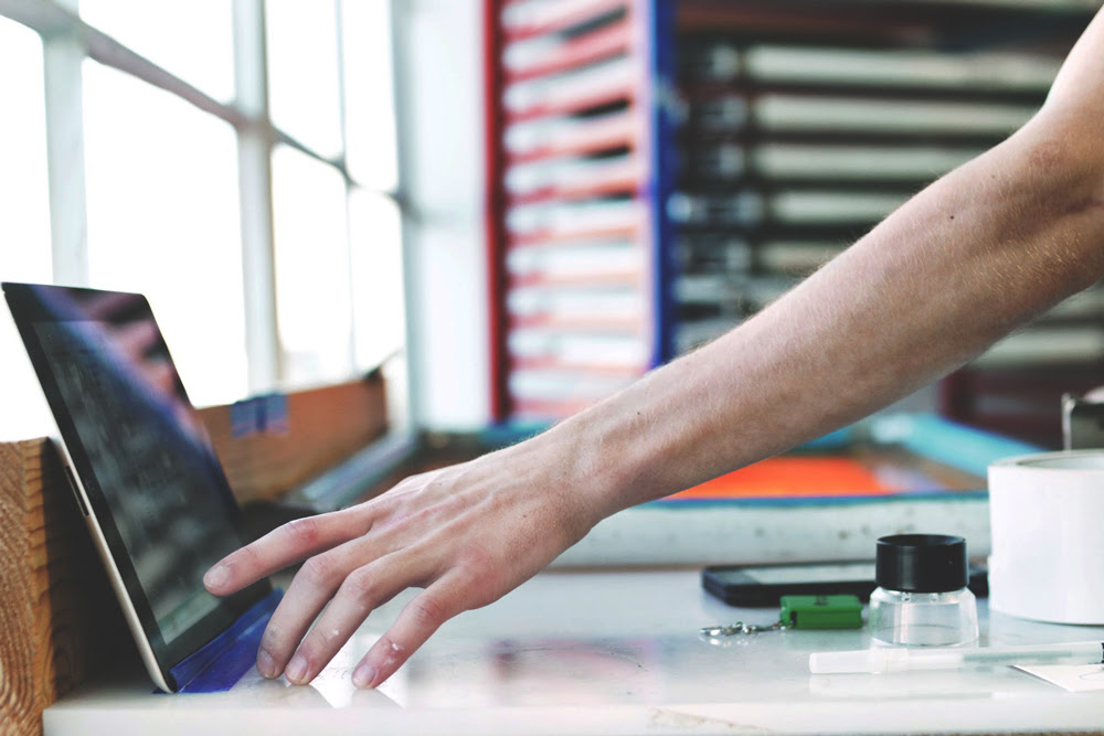
It’s been a month since we teased it, and a major decision has come along with a lot of development on Phase 2 of Central and the Trust website.
The first edition of our website was built by the incredible John Harper, but his plate is unfortunately too full to handle Phase 2. We kicked around a few ideas on moving forward, and we have landed on something daunting and exciting: we will be taking over full design and development of our website in-house. Specifically, our Creative Director Jesse (me) has begun an intense education in web development to supplement his existing coding knowledge and take over maintenance and further site development moving forwards. We have a fantastic plan and design for the new update, and we now have the exciting opportunity to develop it in tandem with Central 2.
Step one was to add a direct link to our blog in the website header, which was accomplished successfully last week. It might not seem like much, but understanding, editing, and updating the website is a great first step. On a side note, check out our blog and tell your friends, we think they’ll like it.
This has begun to be our modus operandi, mirroring the inception of Central and Matt’s decision to take the development task onto himself. If you missed it, last week we published an in-depth look into Central on our blog, exploring what it is, how it came to be, and how it makes our lives easier. It’s one of the most exciting and unique pieces of Trust, and it is only getting better.
Print of the Month

Compete Everyday — Coffee & Squats
Plastisol Cool Grey 6 on Next Level 6051 – Premium Heather / Vintage Black
—
This month’s print comes from the great Compete Everyday. CED is a motivational athletic apparel brand that we have had the honor to print for and grow with for over 3 years now. We actually did a blog post highlighting CED and their awesome business. But we are here to talk about this shirt!
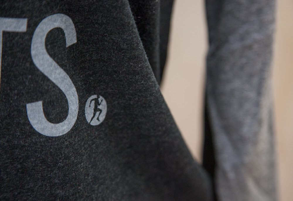
Coffee and squats is a fantastic use of a one color print, with a great concept, a great design, and a great blank to match. Matching the sleeve color of a blank is sometimes a hassle, but in this case it worked perfectly, creating an extremely cohesive product.
Being an athletic brand, CED has to think a lot about wearability. This tri-blend baseball tee is very soft and breathable, and the single ink sits thin on top of it for a print that you will never feel while wearing it. Knowing the purpose and the context of a product allows us to work with our customers to find the perfect garment/ink combination for their needs.