


Respect the Art: How we Work Together to Build a Reliable Color Matching System
This is the second post in our Respect the Art series, in which we demonstrate all of the ways we strive at Trust to respect every piece of art we receive. We are looking across all of the departments and processes of Trust to discover all of the little things that we do which culminate into very big things—consistent prints that match the art as closely as possible.
In screen printing, our pieces of machinery are our tools and the inks are our materials. Trying to print a piece of art with incorrect, faulty, or inaccurate ink is like building a chair from IKEA with the wrong box of parts. You might end up with something that you can sit in, but it will be a Torbjörn instead of the Poang you wanted (#ikeajoke). We are committed to giving our customers what they want so we must make sure that we have all of the correct materials so that your chair (prints) will be produced exactly how you ordered them. We have multiple processes and departments working together to ensure that our ink is accurate, predictable, and repeatable—and we never, ever charge for color matching.
The Pantone System
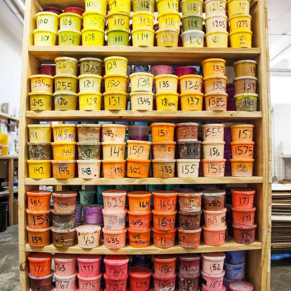
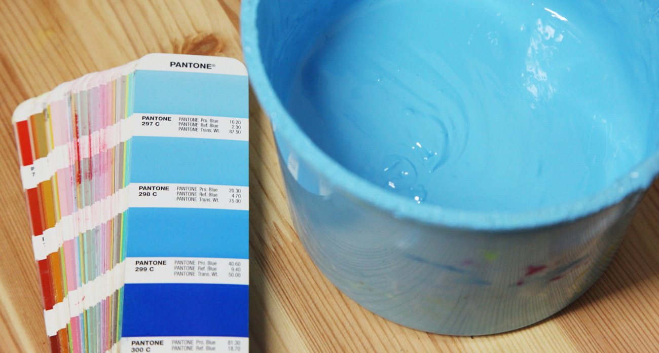
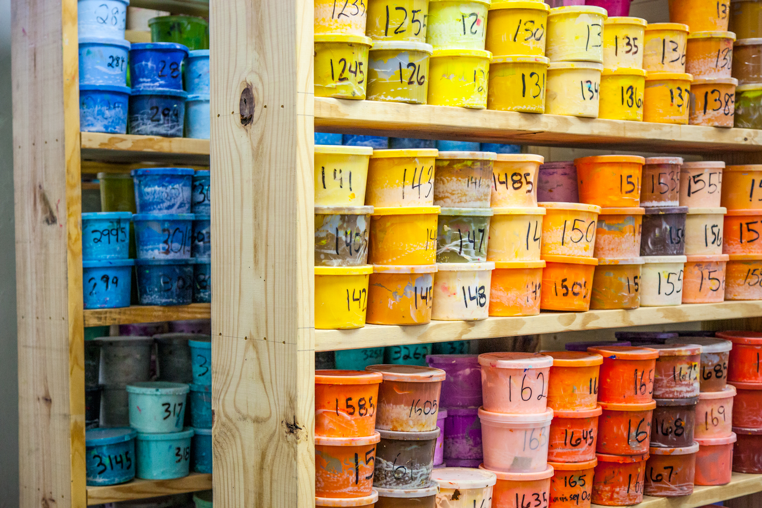
The first step to creating a company-wide color matching system is also the most vital: making sure we are all looking at the same colors. The level of accuracy we are talking about simply cannot be accomplished by calling colors “light-blue”, “blue”, and “teal”. In fact, we need 1,737 colors to hit the level of accuracy we strive for (and sometimes that’s not even enough). You’ve probably heard of Pantone. They create a color matching system that is used fairly universally in the printing industry. Each color is represented by a number, which looks exactly the same in every Pantone book in the world. We have at least one Pantone book in every department, so we can be positive that the 485C I ask for in the Art Department is the same 485C that Grace in the Ink Department will produce. Computer screens are all different, and the transition from screen to physical ink can cause issues, so this gives us a physical representation of the ink to compare to. This also means that for a little over $150, any of our customers can call out a specific Pantone color and know exactly what we are going to print.
Art Department
The Art Department begins our process by filtering the customer’s art into a printable image and then separating it into specific Pantone colors. When an art file comes in, we check for any colors that are outside of the realm of printing capability (computer screens can display a lot of colors that don’t exist in ink form). We try our best to make sure we don’t mock up something that’s outside of our color range. We also attempt to predict how colors will react to other factors (underbases, fabrics, etc.). We’ll meet back up with the Art Department later, and you can read more in-depth about our mockup process here.
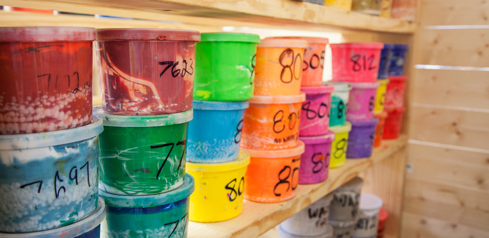
Ink Department
After the art has been set up for printing and those colors have been relayed, the Ink Department gets to work creating, organizing, and preparing the inks for press. Right now our Ink Department is run by Grace Johnston, who also assists in the screen department. Every day she checks her iPad interface and sees any ink that is needed for upcoming jobs. We keep a stock of the colors we create, so nine times out of ten we already have the ink created. If we don’t have the ink, the ink is old, or we need more to complete a job, Grace will create it from our formulas. We have a fully digitized database of formulas for each available Pantone color, so Grace will plug in how many grams of ink she needs and build it from the formula. Ink is created by combining a base (plastisol or waterbase) with colored pigments. Grace uses a scale to measure the proportions up to 100th of a gram, and when the ink is complete, she strikes it off on white paper to show the true color of the ink on a surface. Then she double checks the ink to the aforementioned Pantone book. If the color is not absolutely perfect, she will carefully add pigment to the mix to hit the color perfectly, and she will track her changes and overwrite the old formula with the corrected one.
Production
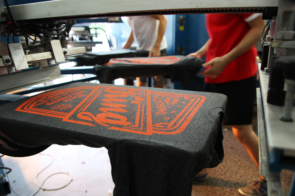
When Grace has finished an ink (and has assured it matches the Pantone), she brings it over to production where they attach it to the applicable order. When we hit production, things get a lot less mathematic and a lot less predictable because we introduce a huge set of variables to the ink. Fabric makeup, fabric color, ink thickness, fabric reactions, migration, curing, and the other inks in the print will gang up to shift our perfect ink color in unexpected ways. We have slowly become better at predicting how the inks will react, but we are frequently surprised when an orange will suddenly come in bright yellow, or a tan will lose all of its color when it hits an underbase. We have developed several techniques for counteracting these discrepancies, including specialized inks for different fabrics, dryer temperature, and flash control. In almost every case, a combination of these techniques and our printers’ diligence will land us on the perfect color.
Press Checks
The final step of the process completes the circle of checks and balances. We print a sample of each job, which is brought back into the Art Department for a press check. The press check is the most vital step in respecting our customers’ art, because it critically compares the physical print to the approved mockup. Specifically to color matching, we closely compare all printed colors to their digital counterparts and make any changes necessary. Although in most cases our color predictions are spot-on, we are not afraid to change from our predicted colors, and we hold an infuriatingly (for our printers) high standard when it comes to color matching to the mockup. We will try as many colors as we have to in order to match the mockup as closely as the Pantone system allows. When the artist is satisfied with the print, they mark the job as approved in our database. This unlocks the job on the Print interface, and without that approval, we will never begin production on an order.
Epilogue: Quality Control
Even though we have approved a printed sample of shirt to the mockup, we are not satisfied in the assumption that every print in the order will come out exactly the same way, so we have placed two highly-critical Quality Control Specialists at the end of the dryer to compare each print that comes down with the approved sample. Prints can shift throughout a run due to several factors, and our QC-ers are ready to call out any discrepancy so the proper adjustments can be made.
Conclusion
This may seem like a lot of work (and it is), but we simply can’t accept colors that don’t match the customer’s art. Our jobs as art reproducers are simply that: to reproduce the art as faithfully as possible. We don’t limit our customers to a small set of colors and we never charge for color matching because we believe it is part of our job description.