Tutorial: Creating Distressed Art in Photoshop using Textures
This is our Distressing Tutorial Series. Distressed art refers to the grungy, faded, or damaged aesthetic that has become quite prominent in design (especially t-shirt design). Of course I know we’re all too cool to jump on the latest fad, but in this case it is popular for some good reasons. First of all, it just looks awesome giving designs that handmade quality that everyone loves. Second, it prints beautifully, allowing us to lay down a soft, thin ink that feels great to the touch and even better when worn. When done well, distressing can take a good design and make it great on a shirt. This series of posts will cover a few of my favorite techniques for distressing art. I will be using Adobe Photoshop and Adobe Illustrator because that is what Trust Printshop bought for me. I hope you follow along, learn something new, or comment and tell me why my techniques are stupid!
Technique Number 2: The Texture Technique
The method I am going to show you today is accomplished entirely in Adobe Photoshop (ok, you caught me, I made the original lettering in Illustrator). If you are more comfortable in Illustrator and you missed my first distressing article, I’d suggest checking it out here. This new method feels slightly more advanced to me, but if you are more familiar with Photoshop than Illustrator that will certainly not be the case. If you would like to follow along exactly with my tutorial, you can download my starting files here. Also, I’m going to be working on a Mac and referencing those keystrokes, so if you are on a PC you will probably have to figure out the applicable keystroke, but the rest of the tutorial will apply.
Our Illustrator Grain Technique from last time resulted in a vector file, but this technique will live in the world of raster. If you don’t understand the distinction between the two, please check out this article I wrote a few months ago attempting to explain it. The important thing to know is that once we start this process, you will not be able to go back and resize your art, so make sure your sizing and resolution start out correct. If you are working with my files, you will notice that I have sized the text around 10” wide at 600 pixels per inch. If you are not working with my files, the cardinal rule of printing is to create your art at the dimensions you want it printed at least at 300 pixels per inch. So open your art in Photoshop, lock your kids in their rooms, put on some noise canceling headphones, crank up the tunes, and let’s get started.
Step 1: Set up your Texture
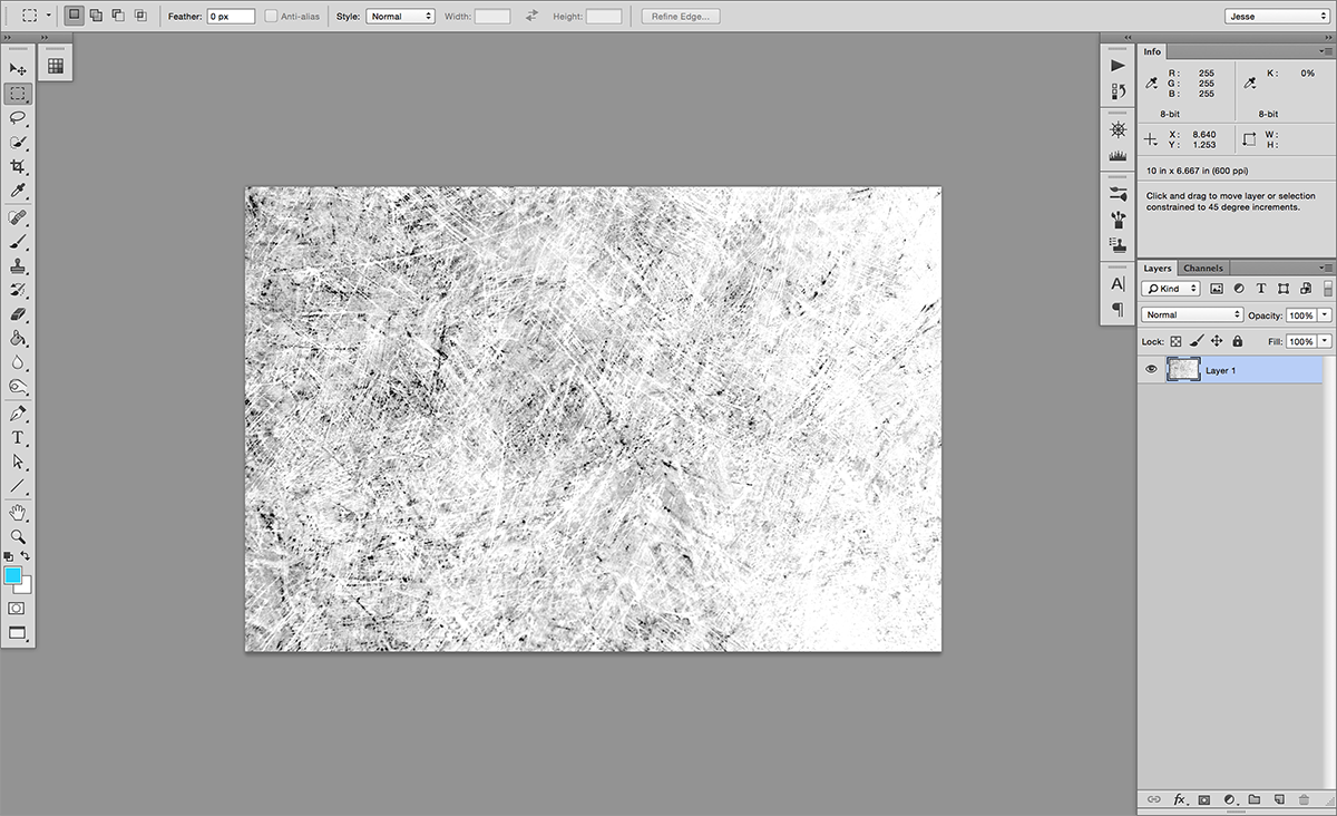 We are going to start with the texture file, so if you’re using my files open up the texture image. If you want to use a different texture, please don’t use copyrighted images. There are several resources for finding royalty free images, so there’s no need to steal someone else’s work for your texture. Creative Commons search will comb through several resources to find you quality images, and Google Images has a “Usage Rights” dropdown under its search tools to easily find free images. If you’re searching for an image to use, look for high contrast, high quality images and try to imagine the texture overlaid on your text (bonus for low color images, which will more easily convert into a text-overlay).
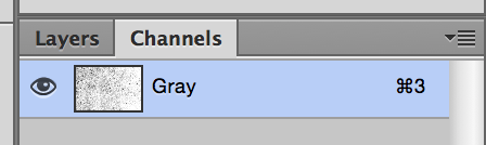
Once you have your image, open it up in Photoshop. Our first step will be changing the color mode of our image to Grayscale (Image > Mode > Grayscale in your Ps toolbar). Now we will flip over into our channels palette, where you should just see a single gray channel.
Grab that channel’s information as a selection (hold Command and click on the channel in the channels palette), then go back to your layers palette and make a new layer. We are going to fill this new layer with black (make black your foreground color and then hit Option+Delete), but you might have to invert the selection to get the right information (Shift+Command+i or Select > Inverse from the toolbar).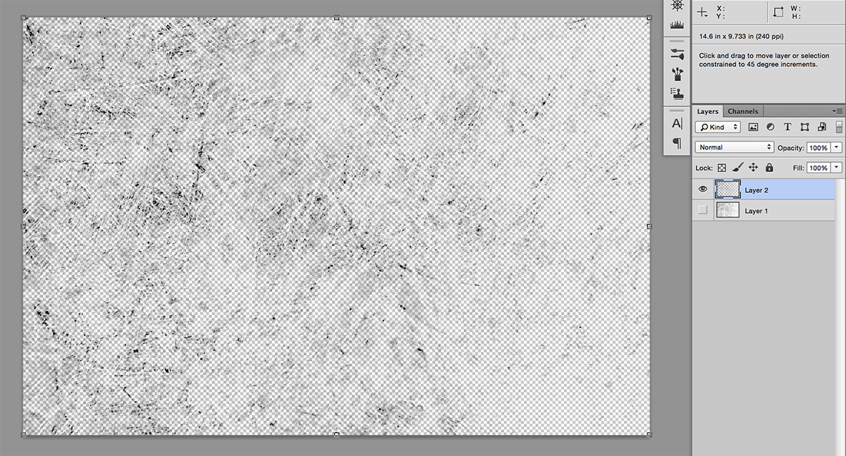 Now we are ready to move to the text file, so open that up and drag our new textured layer over.
Step 2: Apply your Texture
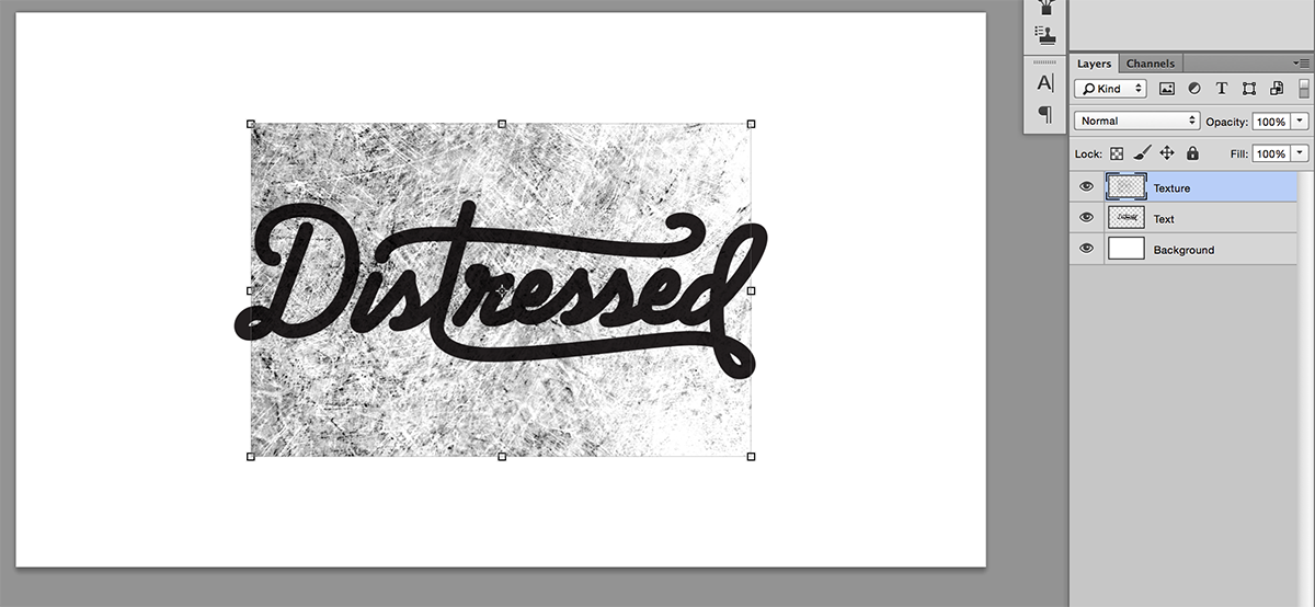 Now that we have our texture in the same file as our text, we need to resize and position it to fit the text properly. PRO TIP: Make a background layer, and make the background and the texture the same color. Then make the text a contrasting color so you can preview how your texture will look before we actually apply it to the text.
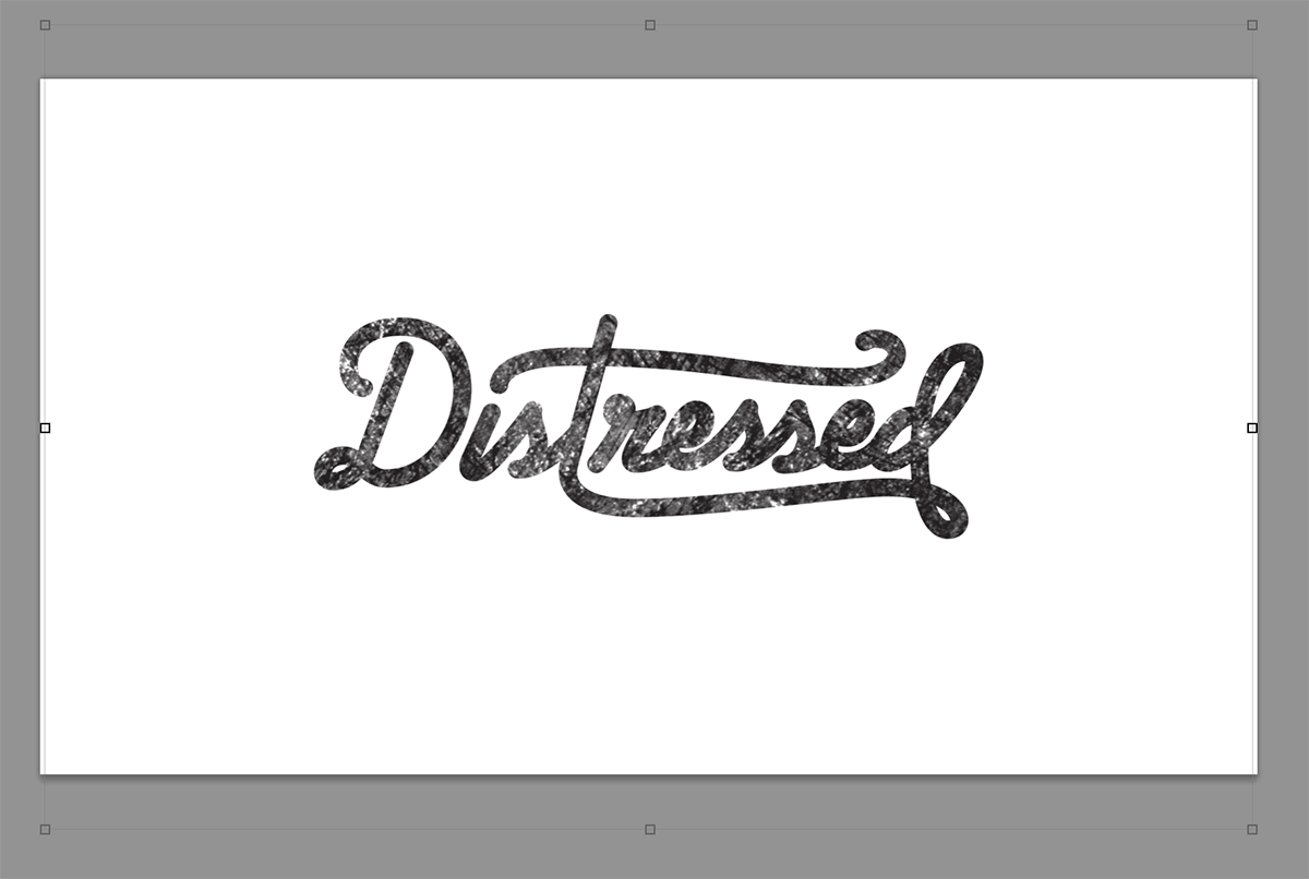 Once you are happy with the positioning and sizing of the texture, hide the texture layer and then grab its information as a selection. Next select the text layer and create a Layer Mask (the small rectangle icon with a circle in it at the bottom of the Layers palette.
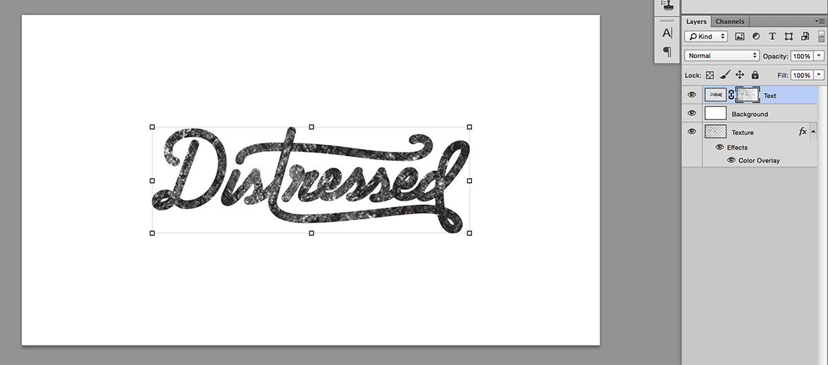 This is preferred to deleting the information from the text, because it is not destructive, and if you end up wanting to make a tweak you will still have the unharmed text underneath to work with. So now you should see the selected information applied to the text (you might have to invert the information at this step, depending on if you inverted earlier in the process).
Step 3: Adjust and Perfect
So we are basically at the end of the process, you have successfully taken a photograph of texture and applied it to your text. All that we have left now is to do any necessary tweaking. You might notice that if you have the text layer selected and you flip over to your channels palette we now have a channel for our mask. This is how we make tweaks to the information in our mask. If you are using my texture, you will probably want to boost the contrast to avoid a lot of mid-tones muddying up the text. This will also help the text look distressed instead of looking like it just has a grayscale photo overlayed on it. Use Curves (Command+M) and/or Levels (Command+L) to get your mask looking just how you like it.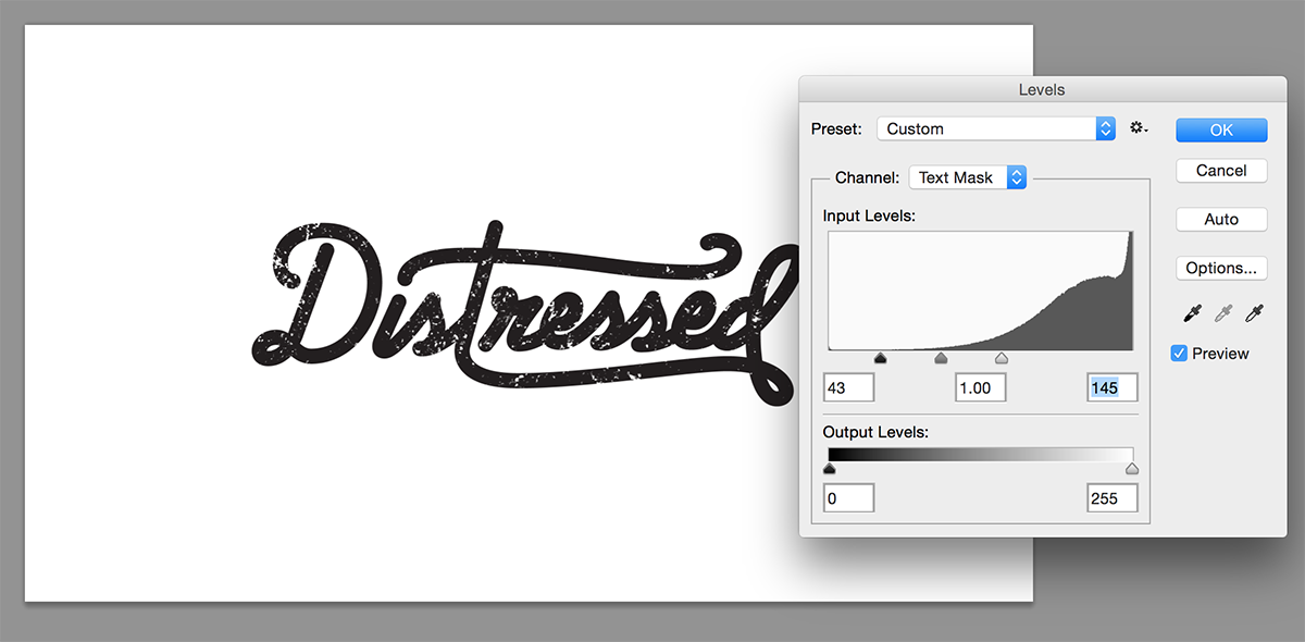 You might also want to go in by hand and add or remove pieces of the texture that fall in a weird spot or disrupt the text.
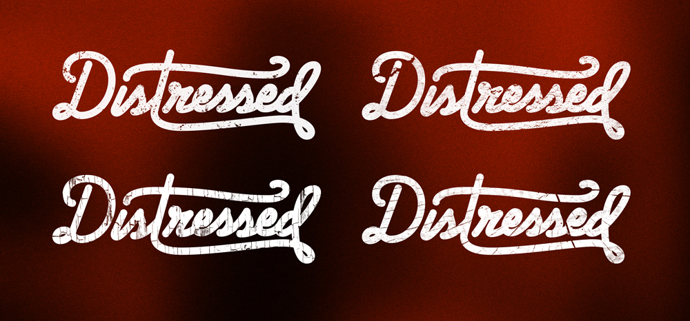
 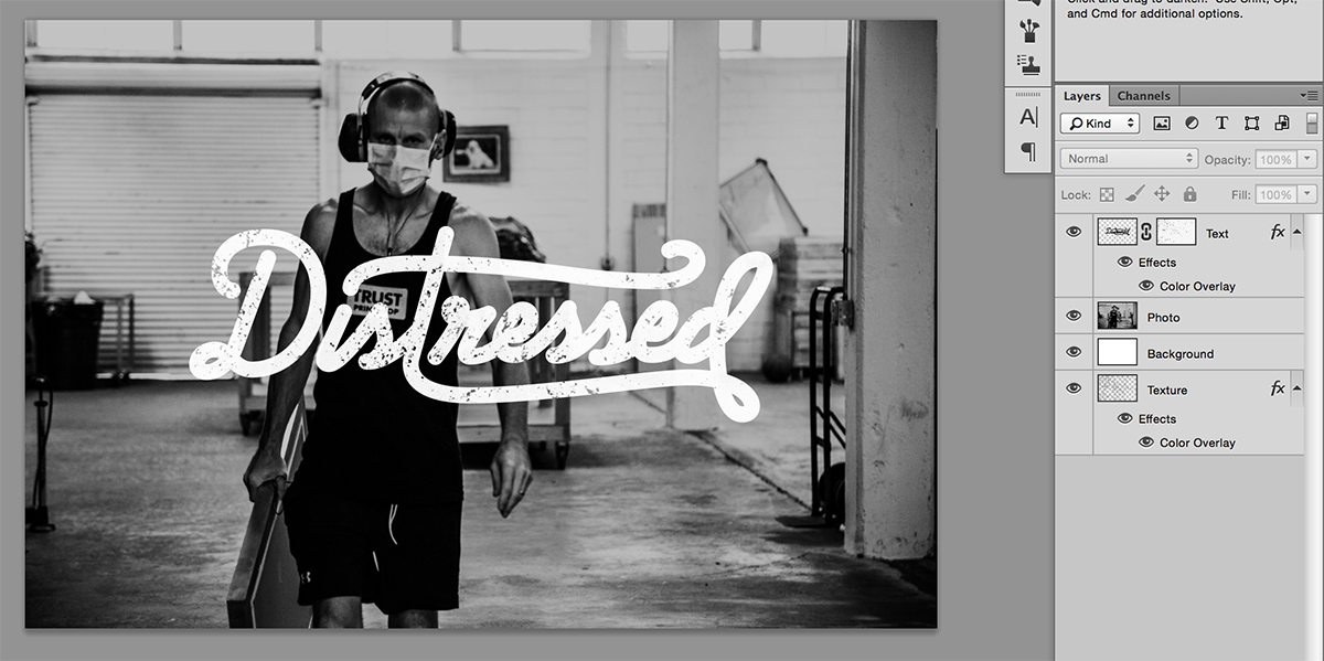 And that’s it! You now should see your text distressed with the texture from your photo. Since we used a mask to do our distressing, you can now make multiple copies of the layer and apply different textures until you find what you’re looking for.