


List: 10 Great Free Fonts for T-Shirt Design
An Important Choice
Hello fellow t-shirt designers. Let’s talk about fonts for a minute. If you have any sort of formal design education or if you have ever spent time on your own learning design practices then you have most certainly had “font choice” smashed into your brain from all sides. I’m not going to get into basic font selection, because there are many great resources that do a very good job of teaching you how to select and pair typefaces like a pro. Instead, I’d like to narrow our focus to fonts in t-shirt design and then share some great free fonts that I have come across.
A Few Tips
Here are a couple tips to get you started if you’ve never put together a text-based design before. Don’t warp or distort your fonts unless you really know what you’re doing. If you’re in Illustrator or Photoshop, keep your finger on the shift key while you’re resizing text. Font creation is a delicate and considered process, there are a lot of small details that make a huge difference when you look at a word or a phrase as a whole. Also be very careful using strokes on fonts. It follows the same logic, but if you take a solid font that someone spent months designing and then have Illustrator guess how the strokes of it should look, you’re probably going to run into issues. Make sure you take kerning into account. Kerning refers to the space between letters, and many free fonts will not have it built in. You won’t know until you try it, but watch for problem pairs like AV, LT, and LY.
These typefaces I’ve chosen will almost exclusively be big and bold. A t-shirt provides a very limited window as an advertisement. Whether you’re walking past someone, seeing them standing on the side of the road, or looking at them from across the room; the text on the shirt must be quickly readable from long distances if it is to be the focus of the shirt.
Finally before we dig into these fonts, I want to stress very strongly that you avoid stealing fonts. This is a massive problem because it is so hard to police, and it is something I have honestly been guilty of many times (especially in college). The fonts I’m about to list are free for personal use, but some might have a small fee for a commercial license. I haven’t researched them all, but I urge you to do a little research before you use one to make money, and if it comes up, spend the $20 or whatever it is to repay the artist for all their hard work.
The Fonts (in no particular order)
1. LIBERATOR
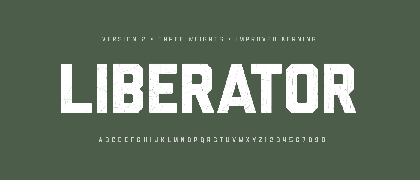 Liberator is a fantastic headline font. It is very bold and very well built for a solid, rugged aesthetic. Its lack of curves or soft edges make it perfect for any project that needs to come across strongly. Liberator is all-caps and includes three weights, glyphs, and numerals. I forgot how much I loved this font.
2. GEARED
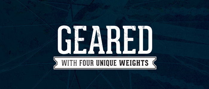 Geared is another headline font, although its Thin and Regular weights could be used for larger blocks of text. It has a little added personality with the semi-serifs and when used bold in lowercase it almost has a vintage feel to it. Includes four weights and an extensive character set.
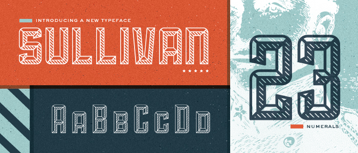
3. SULLIVAN
Sullivan is a small-caps font that pushes the personality even further, with a beautiful crosshatched bevel that looks great as a massive headline. The bigger you blow it up the better it looks, and the Fill and Bevel alternate versions allow for some awesome layering. Includes three versions, glyphs and (gorgeous) numbers.
4. NEXA
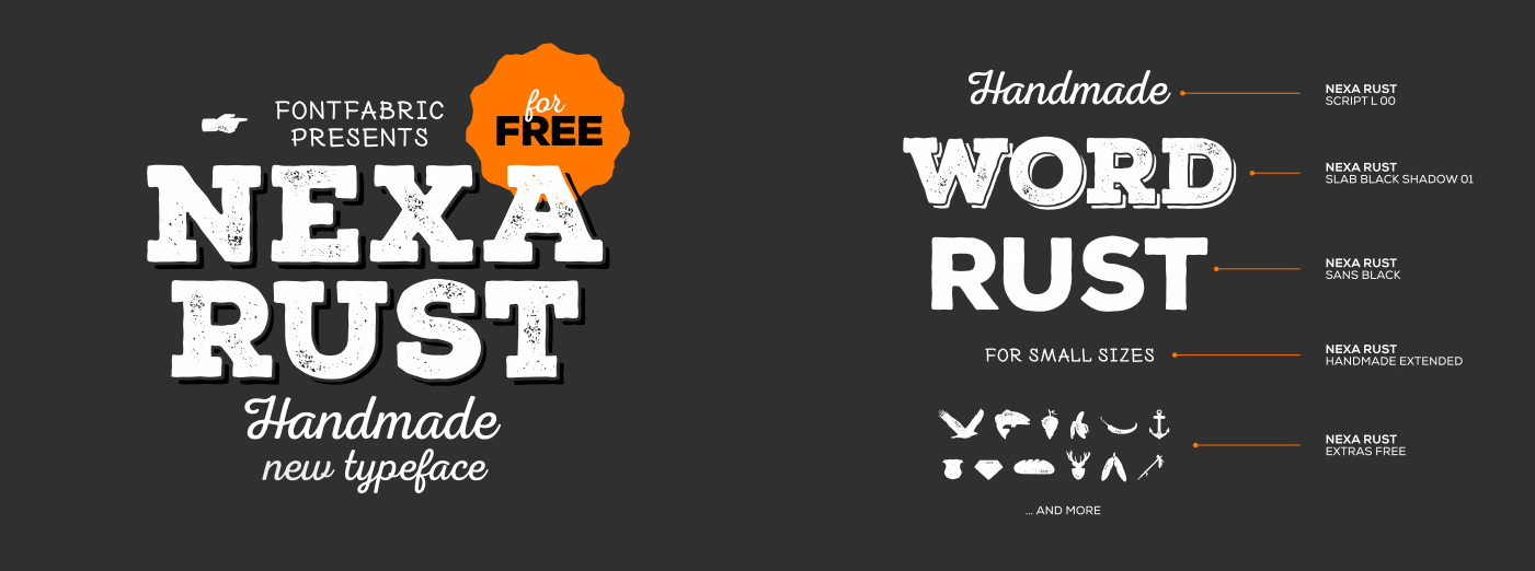 Nexa is the first font on this list that includes multiple different styles into one font family. The wonderful people at Fontfabric have released a free version of their $300 Nexa family with five of the different styles included. This includes a great script, a solid block sans-serif, a distressed slab-serif with shadows, a fun handmade font, and a ton of extra illustrations and icons. They have also specifically released it for free commercial use, so go wild, you could make hundreds of things with just this font.
5. HAYMAKER
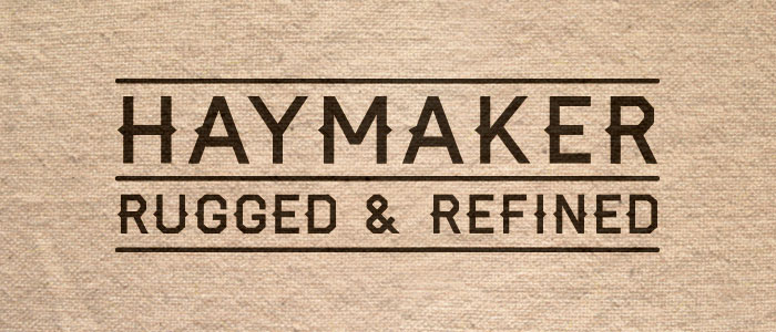 Haymaker is a rugged headline font with a vintage feel. Its applications are a little limited, but it has some great built in personality. Haymaker comes in one weight with numbers and symbols.
6. CYLBURN
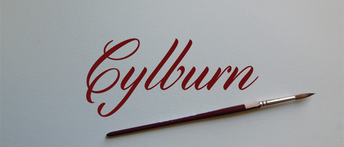 I know we talked about big and bold typefaces, but sometimes a sophisticated script is just what you need for your shirt. Cylburn is a beautiful script font designed by painter-turned-typographer Dai Foldes. It comes in one weight with smart connections and great numbers.
7. QUICKSAND
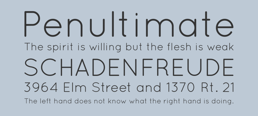 Quicksand is a more normal sans-serif font family. It is very versatile with three weights and a full library of glyphs. This is a friendly, bubbly font, with soft rounded edges and some quirky letterforms. The Bold weight can still handle your large text, while Book would work great for blocks of smaller text.
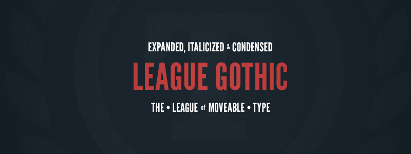 League Gothic is a fantastic font by The League of Movable Type. It is a bold, condensed headline sans-serif. It is most effective at large sizes. It includes a further condensed version for the tallest of design needs, and the lowercase has a bold, vintage vibe.
9. BEBAS NEUE
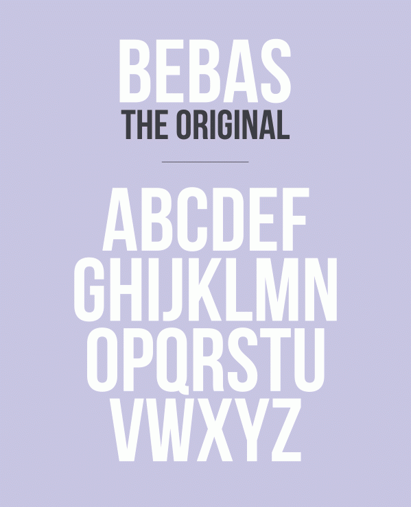 Advertised as the “Helvetica of free fonts”, Bebas Neue is everywhere. It is a simple, straightforward Condensed sans-serif. Bebas is an all caps font with three weights included. It is similar to League Gothic, but takes a cleaner, more simple route.
10. OSTRICH SANS
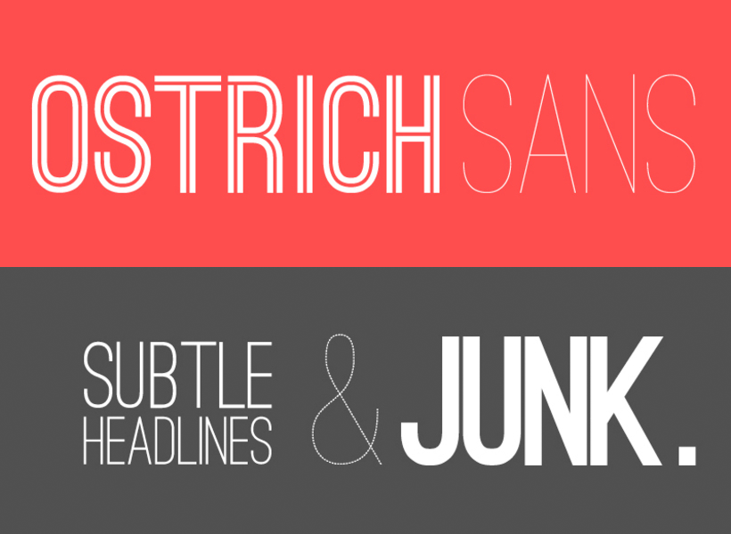 Finally, Ostrich Sans. This is a very trendy typeface, especially the inline version, but it is also a simple, solid font with a large family of weights and styles to choose from. It is pretty versatile for a condensed all-caps sans-serif, and it gives a little more quirky and friendly alternative to Bebas and League Gothic.
Conclusion
I hope this list was helpful. It is in no way exhaustive or complete, just some of my favorites from right now. Please toss some links to fonts I missed in the comments and be sure to check out the font foundries from my list. There are some awesome people doing great work with typefaces.