


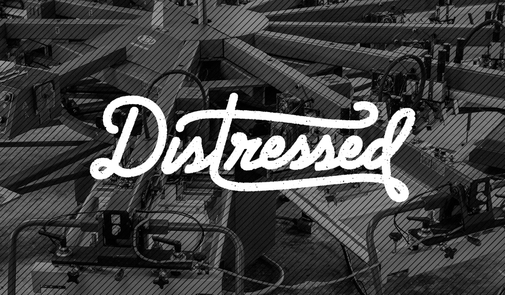
Tutorial: How to Create Distressed Art in Illustrator with the Grain Effect
This is the first post in our Distressing Tutorial Series. Distressed art refers to the grungy, faded, or damaged aesthetic that has become quite prominent in design (especially t-shirt design). Of course I know we’re all too cool to jump on the latest fad, but in this case it is popular for some good reasons. First of all, it just looks awesome giving designs that handmade quality that everyone loves. Second, it prints beautifully, allowing us to lay down a soft, thin ink that feels great to the touch and even better when worn. When done well, distressing can take a good design and make it great on a shirt. This series of posts will cover a few of my favorite techniques for distressing art. I will be using Adobe Photoshop and Adobe Illustrator because that is what Trust Printshop bought for me. I hope you follow along, learn something new, or comment and tell me why my techniques are stupid!
Technique Number 1: The Grain Technique
The first method I will show you is the one I use most often. It is probably the simplest to execute, and the result is—in this creative director’s opinion—quite good. There are certainly ways to get more photorealistic textures using photographs and Photoshop, but for an entirely digital technique, I think this is the best bang for your buck. The Grain Technique—named after Illustrator’s Grain Effect which it relies on—is accomplished entirely in Illustrator, so open that program up, grab some coffee in a spill-proof container (for safety) and let’s get started.
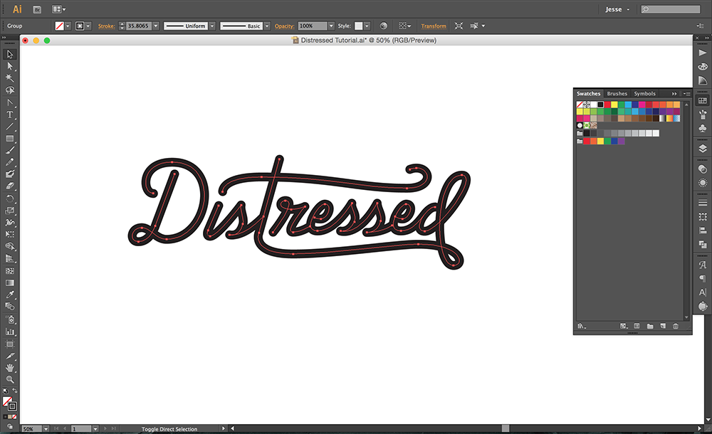
My original art. Describes the technique, not my mood.
Step 1: Creating your Art
As a warning: I said above that a well done distressing can take a good design and make it great, but it cannot save a bad design. I will probably sound like a broken record if you read too many of my posts, but I just want to stress again if you are hoping to sell t-shirts, a professional design can make the difference.
The Grain Technique will only work on vector art. If that last sentence confused you, check out the Educate article on our website about Vector vs. Raster. If you would like, you can download my art file so you can follow along with me exactly. Once you have the art ready, duplicate it or save as a new document so you don’t lose your original objects. Then make sure all strokes are expanded, all type is converted to outlines, and nothing is stuck in a clipping mask. The Grain filter does work on strokes, but I’ve found it simplest to start with a solid piece of art if possible.
Step 2: Get Grainy
Next we will be applying Illustrator’s Grain effect to the art. I have found this effect works best on specific colors with medium lightness and medium saturation (I would avoid black and very dark colors). I usually make the whole piece of art a nice mid-tone red. I have had lots of success with the muted red that sits right next to CMYK Magenta in the default Print Swatches (plug “be1e2d” into the hex code box in your Color Picker if you’re lazy).
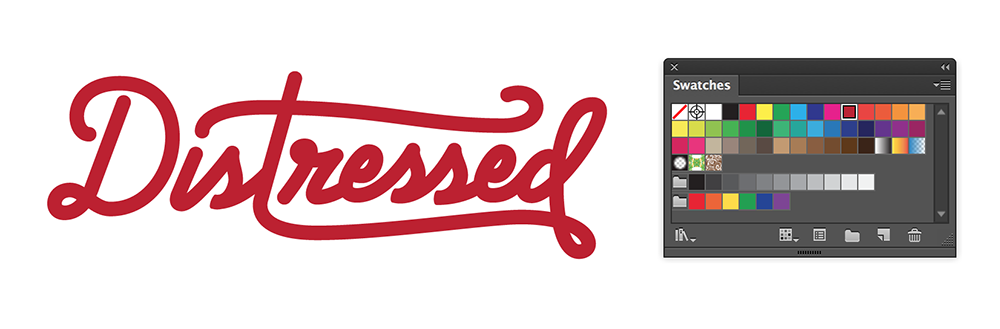
The red I usually go with.
Now we go under Effects > Texture and select “Grain…”. This will bring up a dialog with some options. Below are what I usually go with, but there is a lot of room for experimentation here. I suggest making several duplicates of your art and trying out different settings to see which effect you like the most. Grain is also affected by the size of your art, so you may end up needing to shrink or expand your objects for the grain to look right.
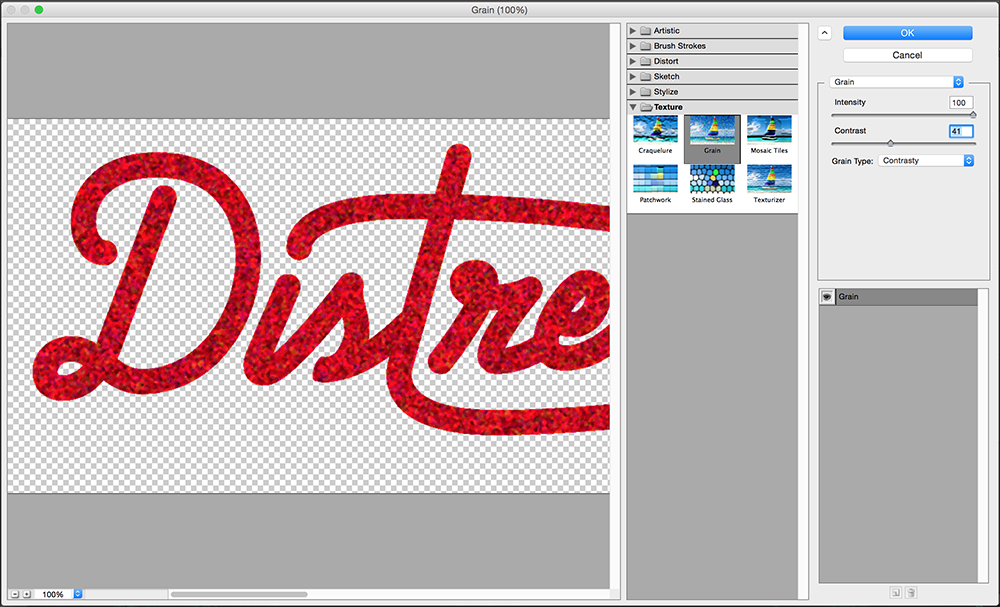
I usually use either “Contrasty” or “Enlarged”.
OPTIONAL: In certain situations you may want to use the Roughen effect on your art as well. This effect adds a rough texture (duh) to all of your paths. I have found it’s most effective on very large blocky objects because the Grain Technique will already add a rough quality to your edges. Definitely experiment with this effect though to give yourself additional hand-made roughness.
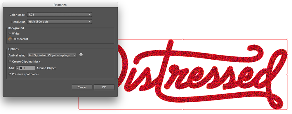
Step 3: Rasterize this Thing
It may seem strange to rasterize something you spent so long creating in a vector program, but in order to get the grainy-ness to stick we have to rasterize the object. (If you zoom in on the grain you can see that is actually already rasterized within your vector shape). Before you rasterize you can still resize your art, and you will notice the grain does not change sizes. At this point I usually create at least 3 different size options with the same grain that I can choose from later. Once you are satisfied with how the grain looks at this size, go up to Object > Rasterize. We want to rasterize at High Resolution (300ppi) with Anti-aliasing set on Art Optimized. This will help us keep as much of that grain detail as possible. Make sure Create Clipping Mask is unchecked and commit.
You will see now that our art is rasterized and all of our pretty vector lines have become pixelated and blurry. Let’s fix that.
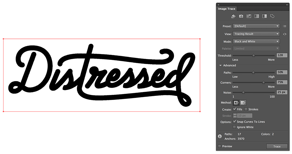
Step 4: Live Trace
Live Trace (or Image Trace as cs6 calls it, but I refuse to out of protest) is a beautiful tool that allows us to automatically turn our rasterized image back into beautiful vectored art. Click on your image and you should see Image Trace on the top toolbar. If not it is under Object > Image Trace > Make. You probably won’t like the initial result, so open up the Image Trace Panel and let’s adjust our settings.
If you’re just looking for rough edges, you can just rasterize your art and then Live Trace it with this higher Threshold
Make sure your mode is on “Black and White”, drag the “Paths” bar up to 100%, and drag “Noise” down to 1. Paths restricts how tightly the tracing fits on the shapes of the image, and Noise tells it how small the smallest dots it recognizes should be (we want the tightest, most textured tracing possible). Then all you have to do is adjust the “Threshold” bar until you like the result. I usually like mine around 70—80, but it all depends on how solid you want the final result. Once you’re satisfied, hit Expand on the top toolbar.
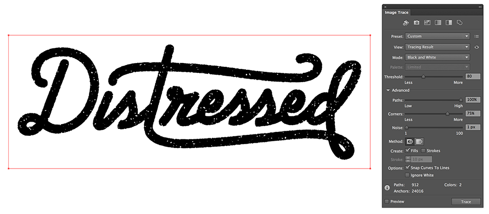
Hint: If you see anything really weird, such as a long solid line cutting through the tracing result, try touching Paths down to 99%. This is a strange glitch that I’ve run into a few times and can’t explain, but that usually fixes it.
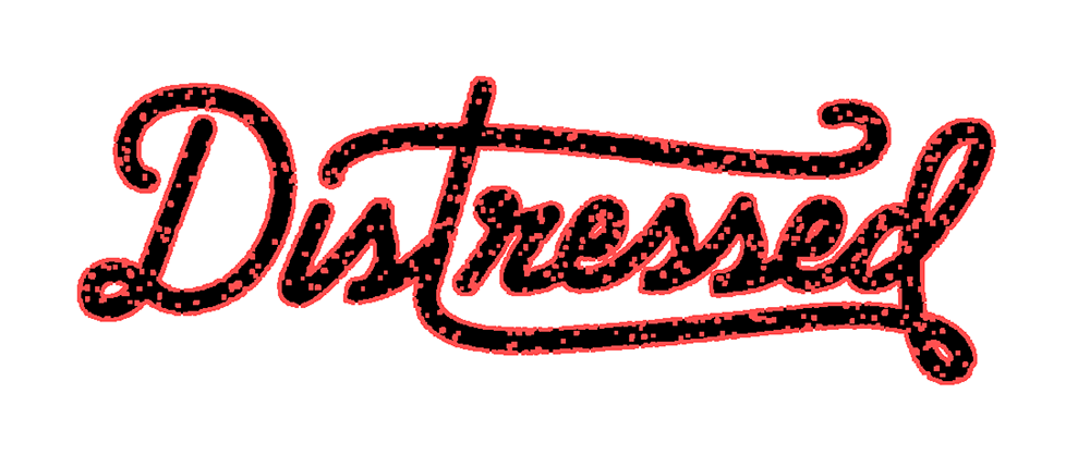
Our gorgeous new vector dots.
Step 5: Finish
Now that your art is expanded you are almost done! Depending on a couple small settings, you might need to delete excess white in the art, and I always recommend grouping pieces of the same art so you never lose a piece when moving, resizing, or copy/pasting. All that’s left is to restore the art back to its original color. If you are unsatisfied with the results, grab one of your duplicates and try it again with different Grain settings, different Live Trace settings, or at a different size.
And that is my super-special Grain technique! This is something that I have stumbled upon on my own, and I would love feedback and critique. Next time we’ll check out my techniques for Photoshop. Happy distressing!